Brand Communication - Advertising Design
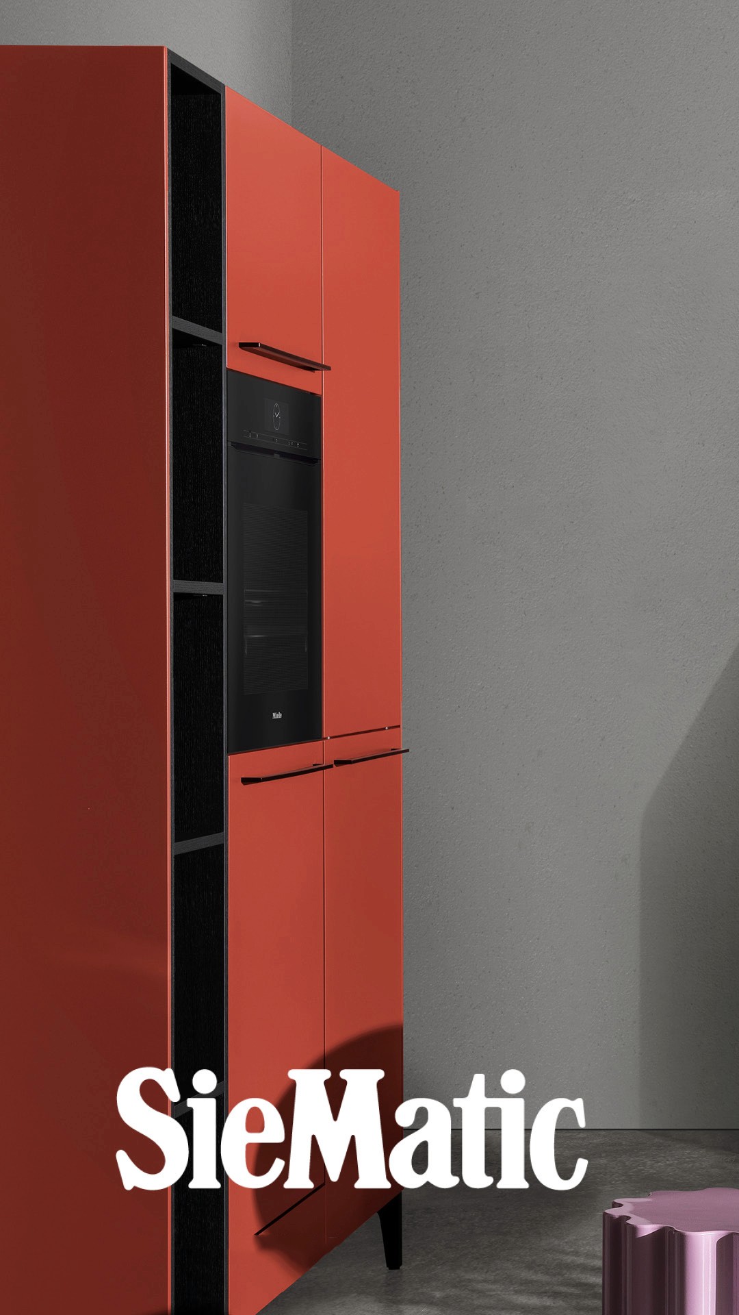
Zeta Interni x Kartell – Visual Identity Ad
Challange
The challenge was to create a bold and recognizable visual concept for a design-focused promotional campaign. The graphic needed to blend Zeta Interni’s brand identity with Kartell’s iconic aesthetic, while conveying a clear, client-centric message. Balancing typography, brand integration, and visual hierarchy was key to achieving an elegant yet impactful result.
Service
Illustrator
Figma


Project Objective
The goal was to design a platform where users could effortlessly share and explore articles while ensuring a visually appealing and structured reading experience.
Design Strategy
Typography: We opted for a clean and professional font style to enhance readability and create a smooth user experience.
Color Scheme: The palette was chosen to evoke trust and creativity, aligning with the nature of content sharing.
Icons & Graphics: Minimalist yet expressive icons were used to support intuitive navigation and enrich the design.
User Experience: A balance between simplicity and modern aesthetics was maintained to keep the platform visually engaging while prioritizing usability.
Interaction Design
Animations and interactive components were implemented to make browsing and reading articles more engaging. Subtle motion effects and dynamic layouts help guide users through the platform effortlessly, ensuring a refined and enjoyable experience.

